News - Dominic Harman's Cover Art (2008)
...HarperCollins UK has commissioned Dominic Harman for a series of new covers as some of Clive's most popular titles are re-issued in paperback. To celebrate, we thought we'd give everyone a glimpse behind the scenes to see just a little of the work that goes into a project like this.
...Together with Luna7, Revelations is delighted to present an exclusive offer to purchase the second of a planned series of Dominic's art covers at a special price.
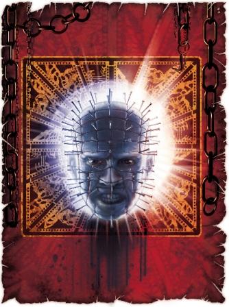
Pinhead is a 16" x 20" Signed Giclee on Canvas, signed by both Dominic and Clive and limited to
50 copies.
These normally retail for $100 each but, with thanks to Hans at Luna7, we are able to offer a
limited number of copies of the Pinhead giclee at the fantastic price of $85!
Orders for the promotional price giclees can only be made via this Revelations link to Luna7*.
Hurry - as these will disappear in no time at all..!
(*NB No longer available)
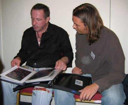
Clive and Dominic looking through Dominic's portfolio of ideas, September 2006 © Phil and Sarah Stokes, The Clive Barker Archive
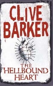
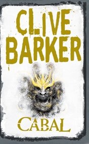
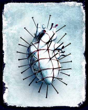
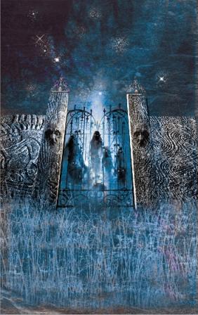
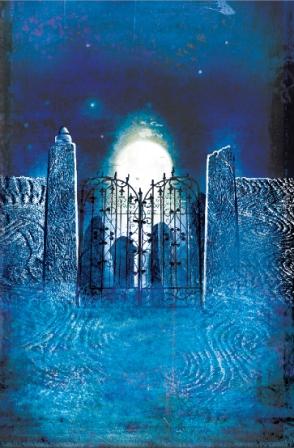
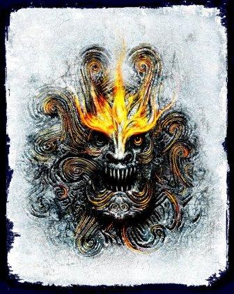
Dominic Harman : "When Harper Collins approached me to work on the new re-issues for Clive Barker, they knew I was a long time admirer of Clive's work and would approach this project with a passion. The publishers wanted to go with something fresh and contemporary, and tasked me to come up with cover ideas. After discussing what should kick off the re-issues for Halloween, we thought it had to be The Hellbound Heart, closely followed by Cabal. We debated whether or not to use Pinhead, and then the image of the heart, grooved and driven with nails, occurred to me. It was fresh and unique - something that had not been seen before. With Cabal, the obvious choice was to use the Midian graveyard and the shadowy tribe. I used the mist and moonlight to create a heavy atmosphere, and saturated the colours in a muddy cerulean. I then started working up an alternative portrait of Cabal, adding yellow & orange streaks of fire and emotion blazing out from the carving to dramatise the portrait."
Dominic Harman : "The fantastic thing about Clive's work is that it
provides an endless source of inspiration. As an artist, I found there were so many choices, so many
options. The hardest challenge was to stick with one direction; I was feverishly conjuring designs
and submitting multiple options to Clive. At that point he called me to say how much he loved the
designs, which is the highest praise an illustrator can get, considering the fact that you're
employed, essentially, to help the client sell something. Not only must you make the cover
eye-catching - as it won't be sitting up on the bookshelf by itself - but you must also be true to
the text, but projecting something of your self in the cover without compromising the integrity of
the book's essence. It doesn't necessarily have to depend on the depiction of a dramatic or violent
scene (and with Clive there is an abundance of stomach churning scenes!), but a strong use of colour
and composition can also have great effect.
"Clive then suggested we do a series of prints with Hans Rueffert, who produces the beautiful canvas
prints for Clive's paintings. We immediately started working on expanding the images - after all,
only the chosen designs will appear on the books, and Clive wanted to create an opportunity to
showcase the alternate designs, images and sketches that go into such a large project.
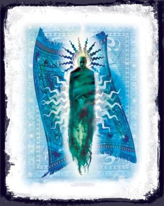
"The next cover design was for Weaveworld - that was a tough one! There are so many elements to the
story, but after brainstorming some ideas I decided to focus on an icon-led design - something with
an emblematic feel. It still had to communicate the ideas and passions of Clive's work and fit with
the new style of book covers, so I decided to incorporate Shadwell and the carpet. I began with the
carpet, creating lots of symbols and designs in Photoshop and piecing them together to form an
interesting pattern, and I photographed some heavy weave material to add a strong textured effect.
It was a very long process!"

Dominic Harman : "With Coldheart Canyon, I wanted to incorporate
Todd Pickett (the fading actor with botched cosmetic surgery), the mansion and the Hollywood
influence. I generally can never settle on just one idea, so I tried to push those tendrils of
creative thought to different places - and ended up creating about 20 variants on the final design!
for one concept I used a house shape (as the mansion looked too blocky in its design and wouldn't
relate to the more organic shapes beneath) I intertwined figures and blood splatters, maintaining
an iconic composition. For the alternative concept, the face, the film strip at the back of his head
represents Todd's film career being behind him; and when it came to Todd himself, I inserted stars
from Hollywood Boulevard into the empty sockets of his skinless face....Beautiful!
"With the Hellraiser concept, I wanted to create something instantly recognisable. It was a lot of
fun to design; the torn fabric represents torn flesh, but is also a subtle reference to the Shroud
of Turin. I think the religious connotation ties in well with Clive's own use of religion that
permeates his work. This one will be an exclusive print. For series two, I am considering delving
deeper into some of the books - perhaps The Great & Secret Show and Imajica - to expand on the
characters, places and concepts that may not have been seen before. As I am hoping to free some
of the images from the constraints of the book cover format, composition and balance can be further
explored and censorship is omitted from the equation.
"People often ask me how I create the images, and in truth it is a hotch potch of different
techniques. There are so many exciting ways to create art - traditional and digital - so why not
embrace it all? I use pencil, oil, acrylic, photography and 3D programs and Models, bringing it all
together as a cohesive vision in Photoshop. I use clay to help me study objects in reality, as well
as plaster and latex, to cast heads and textured objects that I can then photograph or draw from.
One example is when I was designing a CD package design, I cast my brother's head in alginate and
plaster bandage, took a positive mould in fine plaster, then cleaned and prepared it and
photographed it with some effective lighting. I then worked it in with the picture. It was an
exciting project which enabled me to try a different approach to creating an image. I've also used
foam and liquid latex to create interesting sculpted heads and texture moulds to incorporate into
my illustrations. I picked up techniques when I was into special effects at college some years back.
It's a nice way to see my 3D work appear in 2D form. With The Hellbound Heart, I made a clay heart
out of super sculpy so I could observe the shadows and the way the nails are driven in. I also
slashed the clay to imitate cut flesh, and I liked the look so much I decided to keep the cut
flesh in favour of the tattooed grid of the original story. Everyone now identifies that particular
pattern as Pinhead's, and the cut flesh looks gorgeously more gruesome!"